
We’ve all visited bad websites – sites that spring unwanted videos and pop-ups on you, sites that don’t fit on our mobile phone screens no matter how much we scroll and zoom, and sites that form a frustrating maze of links and pages that direct you away from finding the information you need. But how do you get a user to enjoy their time on your website? How can you ensure they feel satisfied in finding what they needed or buying the product they wanted? How do you make them want to come back for more?
Of course, you can just hire a web design professional like Blue Whale Media who works with clients in multiple locations in the United Kingdom like Manchester, Liverpool, and Chesire. Here is more information for their services in Manchester: https://www.bluewhalemedia.co.uk/manchester/web-design-manchester/
1. Follow conventions
Most websites follow organizational rules that provide a mental shortcut for the user in understanding how to navigate the site. Unless you want to be really hipster or rogue, I would recommend creating a logo/ home page link that is consistently in the top left corner of your site. You should place social media links in the footer, situate your search feature in the header, differentiate hyperlinked text by using the blue and underlined font, and locate your main menu with optional dropdown menus horizontally across the top of each page – these familiar visual cues help with speedy browsing.
2. Less is more
Don’t be tempted by superfluous gimmicks, GIFs, and auto-play videos, unless the intention of your website is to mildly irritate the user. Instead, prioritize clarity of design and simplicity of access to each section of your site. You can do this by using clear and concise menu headings and creating white space around key buttons such as purchase links. This visual clarity of website features will make the experience more aesthetically pleasing for the user. Using white space will direct the user’s eye to important elements, helping them to navigate your site more easily.
3. Create a desktop and a mobile version of your site
Often website builders will have a feature that allows you to switch between the two when creating your site. A site that’s appropriate for the device you are using – one that fits perfectly on your mobile display – is far more satisfying than having to scroll across broad sections of text on a tiny screen.
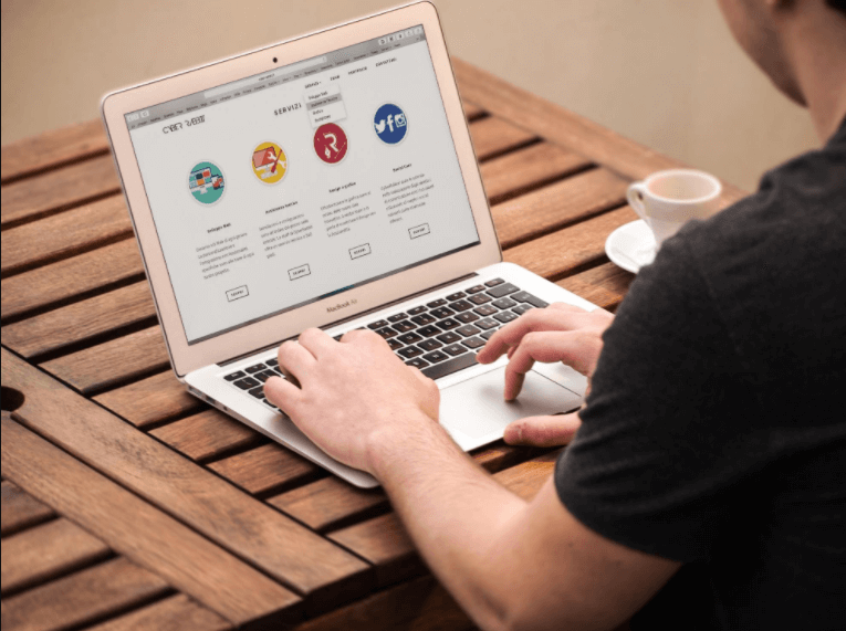
4. Use bullet points
A wall of text can seem intimidating and impenetrable unless your site is a journal or literary resource, it is normally off-putting for users. Instead, use bullet points, or even picture points (placing a relevant picture, icon, or logo next to each text box) to section off information into smaller, more accessible sections. Isolating paragraphs by using white space looks far more appealing, as well as helping users to find information quicker.
5. Use visual language
You can establish a visual hierarchy of headings – headings from subheadings and subheadings from the text, by altering the color, contrast, size, and weight of each heading to help the reader visually categorize the information on the page. Weightier, larger headings draw the eye and indicate key titles.
6. Add your individual sparkle
The best website experiences allow the user to enjoy a sense of the personality and artistry of the creator.